Since a few people in class seemed to have trouble altering the coding on their Google maps so they displayed with the correct amount of zoom, I thought it would be helpful to explain what I did. I had to adjust mine several times before I figured it out, and it was pretty much the only time I ever felt like a computer genius, so here goes:
After you create your map, click on the 'link' button in the upper right corner:
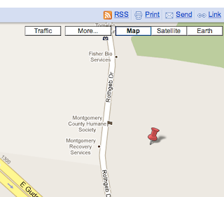
Then, in the box that pops up, click 'customize and preview embedded map.'

A screen will appear where you can change the size and orientation of your map, and you'll notice that the coding in the box corrects itself whenever you make a change. This lets you zoom out on your map to show all your pinpoints (if you have a large area), or zoom in to show individual streets (if you have a small area).
I think Google maps can be a useful tool when writing for the Web. Since so many people already use it, readers won't feel uncomfortable with the technology. The interactive element also makes it especially good for Web writing, because it allows the reader to use the tool, rather than just look at it. Newspapers and magazines can have some well-constructed infographics, but many of these would not stand up to the Web.
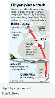
For example, this infographic from the Christian Science Monitor story about the Libyan plane crash has a map and an illustration of the plane, all in one small space. The reader gets a lot of information, and the publication doesn't have to worry about taking up precious real estate in the ever-shrinking news hole. However, if they were to put this on the Web, there would need to be some sort of interactive element to draw in the reader.
My only problem with Google maps is that it can sometimes seem a little boring and pedestrian. Has anyone ever used any other programs to create maps or infographics for the Web?


2 comments:
Tricia, I agree with you that Google Maps can be a pretty boring aspect of a web site. I took Graphics as a journalism class (I think JOUR350 was the course name) and we learned how to make graphics like the one you have from Christian Science Monitor. From what we learned, those are more of a graphic than an interactive aspect of a website. Granted, the class was for print journalism, not online. I think graphics like those are more enticing because their appearance is more enticing and, like you mentioned, less boring. However, I do think the Google Maps has an interesting quality in that users can actually use the maps--get directions, find addresses, etc.
Friends, I gave out during class a list of lots of free software tools you could try to jazz up your Web pages. Google maps are only one small option. Many Eyes, Swivel and Vuvox are free sites that can help with data visualizations and timelines, to name three quick examples.
And kudos to all of you who went the extra mile and tried at least one of the tougher multimedia you learned in class on your story projects --video, photo slide shows and quizzes! Best, Chris
Post a Comment