Friends, in case any of you are interested in taking additional new-media courses in the spring session, here's a link to info on courses attached to the online bureau semester (working for Maryland Newsline):
http://www.newsline.umd.edu/bureauflierfall2006.htm
10.26.2006
good and not so good headlines
http://www.cnn.com/2006/WORLD/europe/10/26/germany.skull.reut/index.html
"Germany orders troops skull probe"
-The story is about Germany ordering an investigation into photos that show soldiers desecrating a skull in Afghanistan. But the wording is awkward. Try reading it out loud. The headline is confusing...the skull of one of the troops? The troops' skull? They have a skull? What? The headline pops, but the wording could have been a little better to avoid complete confusion. Drawing the reader in is one thing, but confusion is just frustrating.
http://www.washingtonpost.com/wp-dyn/content/article/2006/10/25/AR2006102500174.html
"N.J. Ruling Mandates Rights for Gay Unions"
-Clear, to the point. The reader can easily understand that N.J. has made a ruling that's a victory for homosexuals. Let's read more for the details.
10.25.2006
Bad Headline: DNA Testing A Mixed Bag For Immigrants (The Washington Post - 10/25/06)
This hed is confusing because it mixes a commonly serious issue - immigration - with a strange non sequitor - mixed bag. When you read the story, you understand how immigrants are using DNA testing to prove family ties but if the hed doesnt get you into the story what good is it.
Good Headline: For SpongeBob, 3-year-old sacrifices freedom (at least temporarily) (USA Today - 10/25/06)
Somehow this hed works with the same methods that caused the immigration hed to fail. There is a sense of danger in this hed and combined with the Spongebob part, this draws you in to find out what happened.
good and bad headlines
Good Headline: Study Finds Flu Shots are Safe for Kids (Washington Post 10.25.06)
I think this headline is good because even without reading the article you get a little piece of news. You can glance at it, for example and learn that it’s fine to give your child a flu shot. It’s concise and clear and practical.
Bad Headline: Chewing Food With Her Legs (USA Today 10.24.06)
This is for an article about how crabs chew their food with their legs but it sounds really strange on first glance and they could have made it more clear to the reader.
Headline Comparisons
Class, please find a good and not-so-adept headline on one or more news Web sites, and explain why you think so here. Please be sure to give the full URL and headline for each. Please don't write anything you don't want the world to see.
A "not-so-adept" headline
Here's one I found on MSNBC.com's homepage: http://www.msnbc.msn.com/
"Whites pursued Katrina settlements more than blacks"
...Once the link is clicked, however, it's more appropriate:
"Whites challenged Katrina settlements more: Minorities, poor didn't know about resources available to help settle claims"
The first headline made it seem like black people just didn't care enough to pursue them. The second headline gives a better explanation.
9.20.2006
Elizabeth's picture
Feature Story Picture:
http://www.nppa.org/competitions/best_of_still_photojournalism/2004/winners/still/MFS/1st_2772_mental
or
http://www.nppa.org/competitions/best_of_still_photojournalism/2004/winners/still/index.cfm?category=MFS&place=1st&image=3
http://www.nppa.org/competitions/best_of_still_photojournalism/2004/winners/still/MFS/1st_2772_mental
or
http://www.nppa.org/competitions/best_of_still_photojournalism/2004/winners/still/index.cfm?category=MFS&place=1st&image=3
Photographer: John Stanmeyer, VII for Time Magazine
The bright red and green colors first caught my eye for this image. I thought it looked like a photo for an upbeat story. However, when I looked more carefully, it showed a deep sadness.
The skewed angle of the shot suggests madness, imbalance. The little child curled in the corner further expresses the desolation of this place. Then there were the dark shadows of two other children. The image speaks to me of innocent children in a mean, dark abyss.
According to the caption, it is a mental hospital in Karachi, Pakistan. Little boys live there, seemingly abandoned by the outside world. They don't even have shoes or beds.
REACTION TO PHOTO
http://www.poynterextra.org/NPPA2003PJ/pictures/First-PIC.jpg
This photograph grabbed by attention immediately when it appeared on the page. The boldness of the colors and details of the checker board are striking and give the photo a lot of character. The man's hand is a focal point of the picture and contrasts well with the colors of the checker board. The historical figures featured on the board, along with the age of the board and the hand of the man, give the picture character and a sense of history. This picture tells not only the history of the checker board and its player, but also the photographic advances since the time the board made.
Chelsea
Good Photo
http://www.poynterextra.org/NPPA2003PJ/pictures/DON-HM.jpg
I like this photo because the two women probably have never met before and yet the one is trying to comfort the other. I wish I knew what they were saying.
I like this photo because the two women probably have never met before and yet the one is trying to comfort the other. I wish I knew what they were saying.
Shot from NPAA's best of photojournalism
My favorite picture from the NPAA's best of photojournalism 2003 was a still by the Dallas Morning News' Barbara Davidson that came in third place for international news. The photograph majestically captures the anguish of its subjects -- desparing prisoners of war in one of Afghanistan's most isloated and desolate camps. The dirty hands on iron prison bars and the expression on the man's face capture and communicate the misery of the men there.
Mother and her children
This picture http://chnm.gmu.edu/digitalhistory/digitizing/5.php from "Digital History, A Guide to Gathering, Preserving and Presenting the Past on the Web," by Daniel J. Cohen and Roy Rosenzweig is really touching. The picture is really clear and you can see the worry on the mother's face and understand that she is trying to be strong for her children. I like that it is in black and white because it really makes you focus on the emotion in the picture instead of other aspects of it.
photojournalism - cat vacuum
http://www.poynterextra.org/NPPA2003PJ/pictures/FEA-THIRD.jpg
The first thing that struck me about this picture was how funny and bizarre it was. I couldn't believe it was real. But after reading the caption and looking back, seeing how intent the kid was on doing his job, it's really very well done. There is an air of mystery at first glance - it's really hard to tell what's going on, but it makes you want to learn more about it.
The first thing that struck me about this picture was how funny and bizarre it was. I couldn't believe it was real. But after reading the caption and looking back, seeing how intent the kid was on doing his job, it's really very well done. There is an air of mystery at first glance - it's really hard to tell what's going on, but it makes you want to learn more about it.
Good Picture
http://www.poynterextra.org/NPPA2003PJ/pictures/PAPSECOND.jpg
This photo evokes emotion and made me cringe upon first glance. Everyone has been affected by cancer, so this picture can relate to all who view it. It captures the reality of cancer...the fight for those to rid it from their bodies...whatever the cost. As a woman, losing a breast, hair, or other feminine quality can be depressing. The expression on the woman's face in the photo shows despair and hurt. Quite the connection.
This photo evokes emotion and made me cringe upon first glance. Everyone has been affected by cancer, so this picture can relate to all who view it. It captures the reality of cancer...the fight for those to rid it from their bodies...whatever the cost. As a woman, losing a breast, hair, or other feminine quality can be depressing. The expression on the woman's face in the photo shows despair and hurt. Quite the connection.
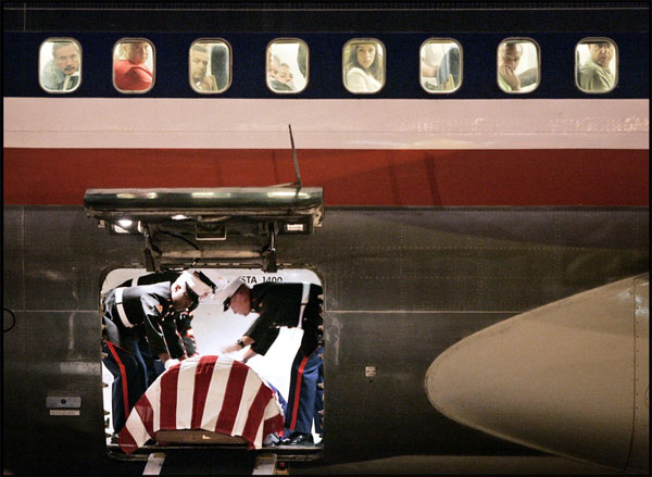
A Good Photo
http://www.digitaljournalist.org/issue0609/images/visapour/5633145-Custom.jpg
This photo has great composition. Your attention is drawn to the casket both through the use of the rule of thirds and because it's framed by the doors. The same is true for the passengers above. They are individually framed by the windows. This framing draws attention to their faces and, more importantly, to their emotions. The gravity of this event is obvious.
This photo has great composition. Your attention is drawn to the casket both through the use of the rule of thirds and because it's framed by the doors. The same is true for the passengers above. They are individually framed by the windows. This framing draws attention to their faces and, more importantly, to their emotions. The gravity of this event is obvious.
Photo Analysis- Israeli Soldier with White Dove
http://www.poynterextra.org/NPPA2003PJ/pictures/SECOND-MAF.jpg
I felt this photo was a great example of color usage and the rule of thirds. The majority of the picture is very dark, which works well with the content-- Israeli soldier and tanks. However, your eye gets drawn to the white dove in the bottom left of the photograph. What also makes this photo work well, is that nothing here is centered... leaving more to look at.
I felt this photo was a great example of color usage and the rule of thirds. The majority of the picture is very dark, which works well with the content-- Israeli soldier and tanks. However, your eye gets drawn to the white dove in the bottom left of the photograph. What also makes this photo work well, is that nothing here is centered... leaving more to look at.
Good Picture
http://www.digitaljournalist.org/issue0609/images/contents.jpg
This picture clearly conveys a sense of place to me. The background indicates a desolate and impoverished land. This picture also envokes an immediate emotional response from the reader because of the anguish on the face of a child that is clearly malnourished. It is graphic and the child is the point of entry.
This picture clearly conveys a sense of place to me. The background indicates a desolate and impoverished land. This picture also envokes an immediate emotional response from the reader because of the anguish on the face of a child that is clearly malnourished. It is graphic and the child is the point of entry.
photo journalism
One of the pictures I found that struck me was this one ( http://www.digitaljournalist.org/issue0609/feature14.html ) from the digital journalist. I really like the bright colors and think they make an interesting contrast to the sadness and emotion the photo invokes. The perspective also makes the viewer wonder what the child is staring at. It's very effective.
Photo assignment
I like the picture at http://www.nppa.org/news_and_events/news/2005/03/images/BOP02_Web_Best_Picture_Sto.jpg
It is a very powerful image as the person in the photo is helplessly looking for aid as dead bodies lie behind him. The person is clearly in pain and anguish and is yearning for help seemingly from the photographer. It is also shot from an interesting angle.
It is a very powerful image as the person in the photo is helplessly looking for aid as dead bodies lie behind him. The person is clearly in pain and anguish and is yearning for help seemingly from the photographer. It is also shot from an interesting angle.
Photo Assignment DGill
http://www.poynterextra.org/NPPA2003PJ/pictures/HM-HENDRICKS-PIC.jpg
This photo is a great way to illustrate the opening of hockey season without a bland photo of a team practicing or something in that vein. The contrast is high so it appears the action is happening without any context or setting and the spacing applies the rule of threes while still keeping the full circle in the image and eliminating extra open white space. Additionally, this photo has a cool factor because the painter appears to be freehanding a 20-foot circle without error.
D.G.
REACTION-PHOTO VIEWING ASSIGNMENT--Checkered History
http://www.poynterextra.org/NPPA2003PJ/pictures/First-PIC.jpg
This photograph grabbed by attention immediately when it appeared on the page. The boldness of the colors and details of the checker board are striking and give the photo a lot of character. The man's hand is a focal point of the picture and contrasts well with the colors of the checker board. The historical figures featured on the board, along with the age of the board and the hand of the man, give the picture character and a sense of history. This picture tells not only the history of the checker board and its player, but also the photographic advances since the time the board made.
Chelsea Bland
I thought all the photos were really interesting but i really liked the one of the young men with covered mouths (http://www.nppa.org/news_and_events/news/2005/03/images/BOP02_Web_Best_Picture_Sto.jpg) and the image of the young woman in the church (http://www.nppa.org/news_and_events/news/2005/03/images/BOP02_Web_Best_Picture_Sto.jpg). I think I was drawn into both because they were very simple, almost still, but were really loud images.
I think the first picture was great because it created a simple silhouette. The men lined in that way showed unity, that they were all going through the same thing, but because the figure wasn't shadowed, it also highlighted their individualism. Also, the small crucifix in the background on a very bright blue sky was captivating to they eye. It offered good symbolism.
I liked the second one because of its used of color. The shadows of men in the church window showed urgency or a crowdedness in the church. I felt like something important was happening there, like a meeting.
Photo assignment
http://www.digitaljournalist.org/issue0608/feature05.html
One of the reasons I like this photo is that it applies the rule of thirds very well and is visually appealing for that reason. More importantly, since it has a journalistic intent, it tells its story well. The man in the foreground and the car in the distant both help the viewer get a sense of scale. This helps us tell how large the blanket of smoke is.
One of the reasons I like this photo is that it applies the rule of thirds very well and is visually appealing for that reason. More importantly, since it has a journalistic intent, it tells its story well. The man in the foreground and the car in the distant both help the viewer get a sense of scale. This helps us tell how large the blanket of smoke is.
Internship/Job opportunity
J-Lab Executive Director Jan Schaffer is looking for help this fall at her lab, located just off campus and Route 1 in College Park. She and her staff are doing interesting work with citizen journalism. For more info, see Chris, or check out the signs she's posted around the building...
Here's a link to the J-Lab site:
http://www.j-lab.org/
Here's a link to the J-Lab site:
http://www.j-lab.org/
9.06.2006
Welcome to our Blog

Class, we'll be using this blog throughout the semester to share thoughts on topics we raise in class.
As we get started, you should begin thinking about a topic for your home page essay, and photos that you might use to illustrate it.
6.29.2006
headlines
sorry I forgot to post these yesterday! I had some notes written down at work but they were from yesterdays news so I did a quick search and found some from today.
http://www.cnn.com/2006/HEALTH/06/29/hpv.vaccine.ap/index.html here's a link for a story on CNN about a vaccine for cervical cancer for younger girls/women. The headline says "Panel recommends routine cervical cancer shots for 11-, 12-year olds"
Here's a story that's extremely interesting (a vaccine for cancer??) and could have been done better only becuase I"m not understanding hte focus on 11 and 12-year olds. I know it mentions that in the lead but to me, because it later says in the story that girls as young as 9 can be vaccinated, I don't understand where those target numbers are coming from. What's more, I don't like how 11-,12-year old looks.
http://www.nytimes.com/2006/06/29/washington/29cnd-scotus.html?hp&ex=1151640000&en=1aa0983620edfa9b&ei=5094&partner=homepage "Supreme Court Blocks Trials at Guantanamo"
I think this headline a lot becuase it's concise, easy to read and to the point. We know what happened, which is especially helpful with supreme court stories becuase law cases can get kind of convoluted and hard to follow. Also there was enough space to spell out Guantanamo (I also don't like the abbreviation 'Gitmo' in headlines-- it throws me and i have to think about what it means for a second)
6.26.2006
Headline Writing
Summer class, welcome!
You'll help shape the direction of this online discussion, meant to encourage your interaction on timely topics of importance. Since as a class we're heading into a discussion of headline writing on the Internet, I'd like to direct your attention to this story on ZDNet. It summarizes the findings of a 2006 eyetracking study by Jakob Nielsen, which underscored the importance of strong, attention-getting headline writing.
http://blogs.zdnet.com/BTL/?p=2776
I'd like you to weigh in now, posting links to one well-written and one less-adeptly written headline on a news Web site.
With each link, briefly tell the group where and when the headline was posted and why you believe the headline is strong or not-so-strong. Remember your comments are being published; please be diplomatic. They're due here by the start of class June 28.
4.25.2006
Get to Know Roanoke.com
Class, please make sure you've spent time with Roanoke.com, (http://www.roanoke.com/wb/xp-index), the Web site for The Roanoke Times in southwest Virginia. Editor Mike Riley invited our class to participate in a video conference with editors in their newsroom. Seth Gitner is coordinating.
Roanoke editors are particularly interested in the class' thoughts on "TimesCast," a video webcast shown daily at 3:30 p.m. that features news, sports and entertainment info (see the "Webcast" link on the top left of the home page). But editors would also like general feedback on the site as well: How easy is it to navigate? How well does it use photos? Multimedia? Interactive elements? How well does it leverage content from the paper? How well does it leverage original content--from the Web staff and the community (including blogs/podcasts/citizen stories)? Please jot down some notes on what you see and be prepared to ask thoughtful questions of editors.
Our video conference will take place on May 10, at 3 p.m., during the class. Stay tuned!
4.17.2006
Extra-credit opportunity: Podcasting
The Office of Information Technology on campus is setting up a podcasting event for Maryland Day, on Saturday, April 29. It's called "Podcasting your Memories: Capturing Maryland Oral History." The idea is to have visitors to campus create a podcast of their favorite Maryland memory. The podcast would become a part of the campus' historical oral archive. OIT is interested in recruiting journalism students to wander around Maryland Day and interview people, capturing the audio on an iPod. If interested, please contact Ellen Yu Borkowski, director, Academic Support, OIT. Her e-mail is eyb@umd.edu; her phone is 301.405.2922. Please cc me in on your note. If you complete this assignment, you would be given an automatic check-plus for an in-class assignment which would replace your lowest in-class grade.
4.09.2006
headlines
Good-
Apple Taking Bars Off Windows- LA Times, Apr. 5
This is a story about Apple creating a program that allows Microsoft's Windows platform to run on it. I like the headline because of the imagery of taking bars off windows, like a jail window, that would allow people to be free. But of course they're using the play on words with the Windows operating system.
Bad-
Orphaned Kittens Find Mom in Pit Bull- ABC News, Apr. 5
This is a link to a video about some kittens who lost their mother, and a pit bull who is taking care of them. But honestly, do I even have to explain what's wrong with this headline? If the mom is actually IN the pit bull, how exactly did the oprhaned kittens find her? Not a pleasant thought.
Subscribe to:
Posts (Atom)


